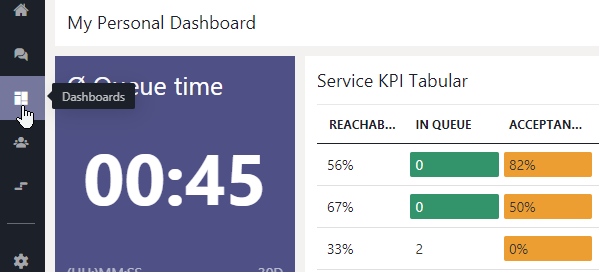
Personal Dashboards are user-customizable walls available to every Contact Center via the Nimbus main menu. Compared to the default Nimbus Service-specific Dashboard - which are hard-configured for each MS Teams "Nimbus" tab - Personal Dashboards offer additional flexibility:
- Fully user-customizable in their appearance, widget placement and filtering.
- Cross-service data display, allowing to include KPIs and metrics from multiple (types of) services simultaneously in tabular or graph form.
- Scalable based on needs, allowing each user to have as many individual Dashboards as needed, each with its own set of widgets, data and filters shown.
PRECONDITIONS
Contact Center feature. To access the Dashboard feature in the Portal main menu:
A Contact Center license needs to be applied within the User Administration. Once the license is assigned, a "Dashboards" menu entry in the Nimbus Frontend UI.
Considerations
💡Before creating your first Dashboards, here are some important thoughts and considerations.
Personal and Non-Personal Dashboards
To unify dashboard design, Non-Personal Dashboards may instead be available (published) by administrators and will be listed alongside any personal Dashboards you've created. Icons help identifying the type of Dashboard.

Dashboard (data) access
- Once created, Dashboards are owned by that Nimbus user and cannot be reassigned. If the user is deleted, all related Dashboards are removed as well
- Dashboard data shown is based on signed-in User Role. Not every Nimbus user has full access on all data. Refer to Dashboard Widgets to see which user role can access the respective widgets and data.
-
Dashboard service filter visibility is following Organization Units rules, meaning that Dashboard widgets show only services that the user is allowed to see (and select), same in other areas of the Nimbus UI.
- OU based filters are set per-widget on each Dashboard. By default each widget with filters will show "No Data" until Services and Users are are added (Opt-in).
- If an OU of a service is changed (moved) outside of the Dashboard owner's visibility - e.g. by an administrator - corresponding services and their data are automatically removed from (any existing) Dashboard filters.
- If a Dashboard ends up with no service filters anymore, "No Data" is shown on all widgets until their filters are readjusted.
- Data updates: Updates to Service KPI. filters and Organization Unit changes may not occur immediately, but upon next data refresh or Dashboard view reload in the Nimbus main menu.
Using Dashboards for alerting and notification
Dashboards may be used to audio-signal certain thresholds. When using them for signalization, please note the following:
INC Audio playback limitation
☝ Audio playback limitation in modern browsers: Chrome (and other browsers) prevent automatic audio playback, only allowing media playback if:
- The media is muted, or …
- The user has interacted with the domain (click, tap, etc.), or…
- .. the domain / app was previously whitelisted in the browser settings.
🤔How does this affect Nimbus? Any kind of signalization (threshold warnings, toasts, notifications) will not play on newly opened or reloaded tab that has not been interacted with. For example, when first-time loading a Personal Dashboards or Non-Personal Dashboards – or force-refreshing any Nimbus UI such as My Sessions with CTRL+F5 – you need to click on it at least once for audio to playback to start.
Creating a Dashboard
A new Dashboard consists of a Dashboard card (high level overview of boards) and the widgets to display data in the dashboard itself. To configure both, follow the steps below:
Dashboard Properties
- Click "Create New" on the main Dashboards overview.
-
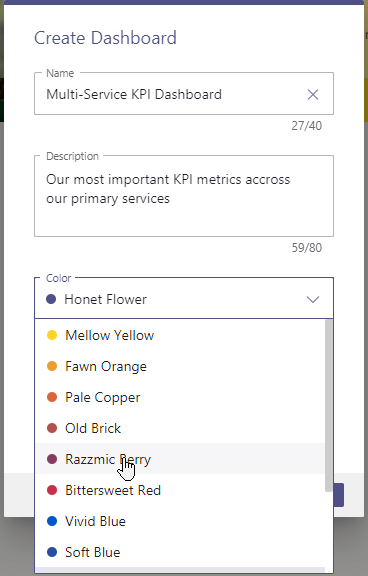
Fill in the details for your Dashboard:
- Name - as your Dashboard will be identified in lists. 💡Mandatory, max. 40 characters
- Description - will be displayed below the name. 💡 Optional, max. 80 characters
- Color - will be used as background for the dashboard tile if you don't specifiy an image 💡 Mandatory
-
Picture - a background used as thumbnail for your Dashboard card in the overview. 💡 Optional, max. size 1 MB. The image will be scaled to fit.
💡 Tip: You can review these settings on any existing Dashboard.
Dashboard Widgets / Edit Mode
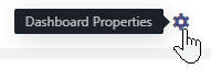
✅ On any existing Dashboard you can reach the Properties (Previous Step) and Edit mode on the top right. → A grid for Widgets will be shown.

💡 A new Dashboard is shown without widgets and opened in "Edit mode" so you can add widgets right away.
Widget availability per User Role
Please note that certain Dashboard Widgets are only available when you have the Nimbus Portal Role assigned on your user.
Learn more…
Dashboard Widgets
INC Dashboard Widget Data Size Limitations
☝FILTER/QUERY SIZE LIMITATIONS
To keep the performance on Dashboards manageable, query limits of 200 users / 200 services each apply on filtering (e.g. when selecting very large Organization Units). This limit applies summed-up across all widgets on the same Dashboard.
💡A warning and counters will be shown when this limit is exceeded and data will not be queried.
💡(Existing) Dashboards that break this limit will not be adjusted retroactively, but also show the warning instead of the actual data query.
Contact Center Portal User Roles with access ► |
SUPERVISOR | TEAM / SERVICE OWNER |
CC USER | ||||
|---|---|---|---|---|---|---|---|
| Widget Group | Name | Description | User | Service | Owner | Owner Limited | Team Member / Agent |
|
Service Widgets |
Service KPI Tile | Shows a single service KPI for the selected services. | ✅ | ✅ | ✅ | ✅ | |
| Service KPI Tabular | Shows Service KPI's per Service in a tabular view. | ✅ | ✅ | ✅ | ✅ | ||
| Service KPI Chart | Shows a single historical service KPI value of today for the selected services with comparative trend and graphical look back. | ✅ | ✅ | ✅ | ✅ | ||
| Service KPI Comparison Chart | Shows Service KPI's in a chart per Service for comparison. | ✅ | ✅ | ✅ | ✅ | ||
| Service KPI Graph | Shows Service KPI's aggregated for one or more services over time. | ✅ | ✅ | ✅ | ✅ | ||
| Service Queue Tabular | Shows the current tasks in queue for multiple services. | ✅ | ✅ | ✅ | ✅ | ||
| Live Service Tasks Tabular | Shows the current live inbound tasks for multiple services. | ✅ | ✅ |
✅ | ✅ | ||
| Service Outbound Tasks Tabular | Shows the current Outboundoutbound tasks for multiple services. | ✅ 🔧 |
✅ 🔧 |
✅ |
✅ | ||
| Service External Tasks Tabular | Shows a heatmap with task resolution information with historical data ranging back up to 4 weeks. | ✅ 🔧 |
✅ 🔧 |
✅ |
✅ |
||
| Service Heatmap | Shows the a Heatfor multiple services. | ✅ | ✅ | ✅ | ✅ | ||
| Service Supervision | Shows the current tasks for multiple services to supervise → See Dashboard Supervision |
✅ ▼ |
|||||
| User Widgets | User Performance Tabular | Shows the user performance information in a tabular view. | ✅ | ||||
| User State Tabular | Shows the current user states in a tabular view. | ✅ | ✅ | ||||
| User State Chart | Shows the current user states in a chart view. | ✅ | ✅ | ||||
| User Supervisor Tabular | Allows supervisors to administrate users. → See Dashboard Supervision |
✅ ▼ |
|||||
| User Tile | Shows a count of users matching your filter criteria. | ✅ | ✅ |
||||
| Common Widgets | Markdown | Allows you to display formatted text and pictures on your dashboard through markdown syntax. | ✅ | ✅ | ✅ | ✅ | ✅ |
| Date & Time | Shows the current Date and/or Time. | ✅ | ✅ | ✅ | ✅ | ✅ | |
| Embedded Website | Allows you to present external content/websites on your dashboard. | ✅ | ✅ | ✅ | ✅ | ✅ | |
About widget access
🔎Dashboard Access:
- Contact Center User licenses are required to view any personal Dashboards or non-personal Dashboards in the Nimbus UI.
- Additionally, a service-affiliated user role (e.g. member, owner) is required to see data in within widgets, following Organization Unit rules (→ see Data Access Rule below).
🔎Supervision / Agent Roles:
- 🔧 Users with additional extended permissions (Supervisors , Service/Team Owners) can interact with certain widgets, e.g. to perform Dashboard Supervision or delete pending from the queue. ✅ This requires an additional “Supervisor” role, to be applied via User Administration > Roles tab.
- ☝ Note that Supervisors which also act as Agents (assigned in Agent Service Settings) cannot engage in Supervision sessions while they have a call ongoing.
🔎Data Access Rule: Dashboards and data shown inside widgets follow general User Permission and Organization Unit restrictions, meaning:
- Data is shown according to the currently logged in user permissions, not any delegated permissions of the user that created the Dashboard.
- Filter (re)adjustments to widgets are allowed if the user has access, but only by following "reading along the path" Organization Unit rules of that user.
🤔 What does this mean? Dashboard user B may see and customize widgets which may have been originally added by different user A (e.g. an higher level Admin). However, the Service KPI, as well as User and Task information shown inside those widgets is always limited to the services the user B is a part of.
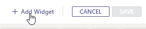
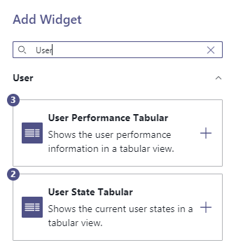
You can also add widgets at any later time via Edit Mode:
- Click on "Add Widget" → A selection of available widgets is shown.
- Add any widget with the "+" button → The widget will appear on a free spot on the grid.
-
Continue to add widgets,
- 💡You can add multiples of the same widget as needed, e.g. with different filter settings.
- 💡A counter displays how many widgets of that type are currently on your Dashboard.
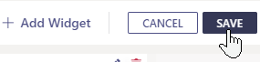
- When done, press Close.
⮑ The Dashboard remains in "Edit mode"
⮑ Your Widgets can now be moved, resized and configured in their Properties individually.
Widget Move and Resize
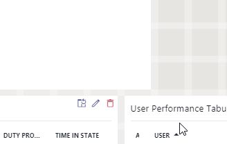
- While in edit mode, each widget shows individual edit and deletion controls on its top-right corner.

- On any widget click on "Edit" → A sidebar with widget properties opens
- You can move and change size (down to a limit) by dragging your mouse cursor.
Widget Properties
For each widget you can adjust widget properties such as:
- Size - by changing the height, weight and size (scaling) of the widget.
- Order - by changing column sorting and order of KPIs / entries shown.
- Scope - by applying filters on widgets which determine which services / users / KPI should be shown.
- Style - by applying thresholds that react to data changes with sound and color.
Show a list of all widget properties…
Dashboard Widget Properties
Dashboard Widget Properties apply to all Dashboard widgets in both Personal Dashboards and Non-Personal Dashboards. This page is organized in four parts:
- Widget catalogue — every widget in Nimbus Dashboards, listed by purpose and user access.
- Shared properties — properties that apply across most widgets (size, scaling, thresholds, …).
- Tabular / chart properties — properties exclusive to tabular or chart-type widgets.
- Per-widget reference — properties unique to a specific service or user type widget.
💡HOW TO BROWSE THIS PAGE
Many widgets share concepts
- Use the Table of Contents on the right-hand side to navigate.
- Use
CTRL+Fto search for elements matching the Nimbus UI. - This resource relies on task-related concepts and Nimbus KPI Calculations.
Privacy Settings
GDPR Data Privacy Tenant Settings: When "Display User State Durations" is disabled in Data Privacy, the Time in Presence State and Time in Duty Profile columns are hidden on the User State Tabular and User Supervisor Tabular widgets, together with any thresholds that reference them. This also affects data and time columns displayed in various “fixed” Nimbus overviews, such as Live View.
Widget Catalogue
Nimbus currently provides 19 widgets, divided into three groups. The widget group determines the data source choices and which properties are available.
Dashboard Widgets
INC Dashboard Widget Data Size Limitations
☝FILTER/QUERY SIZE LIMITATIONS
To keep the performance on Dashboards manageable, query limits of 200 users / 200 services each apply on filtering (e.g. when selecting very large Organization Units). This limit applies summed-up across all widgets on the same Dashboard.
💡A warning and counters will be shown when this limit is exceeded and data will not be queried.
💡(Existing) Dashboards that break this limit will not be adjusted retroactively, but also show the warning instead of the actual data query.
Contact Center Portal User Roles with access ► |
SUPERVISOR | TEAM / SERVICE OWNER |
CC USER | ||||
|---|---|---|---|---|---|---|---|
| Widget Group | Name | Description | User | Service | Owner | Owner Limited | Team Member / Agent |
|
Service Widgets |
Service KPI Tile | Shows a single service KPI for the selected services. | ✅ | ✅ | ✅ | ✅ | |
| Service KPI Tabular | Shows Service KPI's per Service in a tabular view. | ✅ | ✅ | ✅ | ✅ | ||
| Service KPI Chart | Shows a single historical service KPI value of today for the selected services with comparative trend and graphical look back. | ✅ | ✅ | ✅ | ✅ | ||
| Service KPI Comparison Chart | Shows Service KPI's in a chart per Service for comparison. | ✅ | ✅ | ✅ | ✅ | ||
| Service KPI Graph | Shows Service KPI's aggregated for one or more services over time. | ✅ | ✅ | ✅ | ✅ | ||
| Service Queue Tabular | Shows the current tasks in queue for multiple services. | ✅ | ✅ | ✅ | ✅ | ||
| Live Service Tasks Tabular | Shows the current live inbound tasks for multiple services. | ✅ | ✅ |
✅ | ✅ | ||
| Service Outbound Tasks Tabular | Shows the current Outboundoutbound tasks for multiple services. | ✅ 🔧 |
✅ 🔧 |
✅ |
✅ | ||
| Service External Tasks Tabular | Shows a heatmap with task resolution information with historical data ranging back up to 4 weeks. | ✅ 🔧 |
✅ 🔧 |
✅ |
✅ |
||
| Service Heatmap | Shows the a Heatfor multiple services. | ✅ | ✅ | ✅ | ✅ | ||
| Service Supervision | Shows the current tasks for multiple services to supervise → See Dashboard Supervision |
✅ ▼ |
|||||
| User Widgets | User Performance Tabular | Shows the user performance information in a tabular view. | ✅ | ||||
| User State Tabular | Shows the current user states in a tabular view. | ✅ | ✅ | ||||
| User State Chart | Shows the current user states in a chart view. | ✅ | ✅ | ||||
| User Supervisor Tabular | Allows supervisors to administrate users. → See Dashboard Supervision |
✅ ▼ |
|||||
| User Tile | Shows a count of users matching your filter criteria. | ✅ | ✅ |
||||
| Common Widgets | Markdown | Allows you to display formatted text and pictures on your dashboard through markdown syntax. | ✅ | ✅ | ✅ | ✅ | ✅ |
| Date & Time | Shows the current Date and/or Time. | ✅ | ✅ | ✅ | ✅ | ✅ | |
| Embedded Website | Allows you to present external content/websites on your dashboard. | ✅ | ✅ | ✅ | ✅ | ✅ | |
About widget access
🔎Dashboard Access:
- Contact Center User licenses are required to view any personal Dashboards or non-personal Dashboards in the Nimbus UI.
- Additionally, a service-affiliated user role (e.g. member, owner) is required to see data in within widgets, following Organization Unit rules (→ see Data Access Rule below).
🔎Supervision / Agent Roles:
- 🔧 Users with additional extended permissions (Supervisors , Service/Team Owners) can interact with certain widgets, e.g. to perform Dashboard Supervision or delete pending from the queue. ✅ This requires an additional “Supervisor” role, to be applied via User Administration > Roles tab.
- ☝ Note that Supervisors which also act as Agents (assigned in Agent Service Settings) cannot engage in Supervision sessions while they have a call ongoing.
🔎Data Access Rule: Dashboards and data shown inside widgets follow general User Permission and Organization Unit restrictions, meaning:
- Data is shown according to the currently logged in user permissions, not any delegated permissions of the user that created the Dashboard.
- Filter (re)adjustments to widgets are allowed if the user has access, but only by following "reading along the path" Organization Unit rules of that user.
🤔 What does this mean? Dashboard user B may see and customize widgets which may have been originally added by different user A (e.g. an higher level Admin). However, the Service KPI, as well as User and Task information shown inside those widgets is always limited to the services the user B is a part of.
Property x Widget matrix
The following matrix summarizes which property applies to which widget group. ✅ = always available, 🗃️ = available on selected widgets in the group (see per-widget reference below).
| Property | Service Widgets | User Widgets | External Tasks |
|---|---|---|---|
| Title / Show Title | ✅ | ✅ | ✅ |
| Show inline filter and search | 🗃️ (tabular) | 🗃️ (tabular) | 🗃️ (tabular) |
| Width / Height | ✅ | ✅ | ✅ |
| Scale | ✅ | ✅ | ✅ |
| Background Color | 🗃️ (KPI tile) | 🗃️ (User Tile) | – |
| Data Source (Services / Org Units) | ✅ | – | – |
| Data Source (Users / Org Units) | – | ✅ | – |
| Filters: Direction, Initial Modality, Supervision | 🗃️ (tabular) | – | – |
| Filters: Presence / Duty State / ACW / Modalities | – | ✅ | – |
| Time Frame | 🗃️ (historical KPIs) | 🗃️ (Performance) | – |
| KPI selection | 🗃️ (KPI widgets) | – | – |
| Thresholds | 🗃️ | 🗃️ | – |
| Columns / Sorting | 🗃️ (tabular) | 🗃️ (tabular) | – |
| Chart Orientation / Legend / Value Labels | 🗃️ (chart) | 🗃️ (chart) | – |
General Widget Properties
| Property | Description | ||||||||||||||||||||||||||||||||||
|---|---|---|---|---|---|---|---|---|---|---|---|---|---|---|---|---|---|---|---|---|---|---|---|---|---|---|---|---|---|---|---|---|---|---|---|
| Avatar | Appears as a column (userAvatar, avatar) in User- and Supervision-related tabular widgets, and as the visual element of the User Tile widget. The avatar is sourced from the Tenant's user directory and overlays a colored Presence State indicator. |
||||||||||||||||||||||||||||||||||
| Background Color | Applies to the Service KPI tile and User Tile widgets only. Font color automatically inverts to maintain contrast on bright backgrounds. | ||||||||||||||||||||||||||||||||||
| Data Source |
Determines which entities feed a widget. Changing data source clears previously selected items.
✅Role assignment: Selecting Organisation Units requires the matching Service Supervisor or User Supervisor Portal Role. Also see → User Administration > Roles tab. |
||||||||||||||||||||||||||||||||||
| Filters, (Inline Filters & Live Search) |
Filters narrow down the data shown inside a widget. The available filters depend on whether the widget is service-scoped or user-scoped.
☝️ GDPR data visibility:Note that filters determine the “maximum” possible data shown. Further factors may limit visibility, such as:
💡Good to know: Inline filter and search✅ Tabular Widgets only. When “Show Inline filter and search” is enabled on the widget, inline filters are shown on the tabular widget headers.  ☝️Note that the available filters are depending on the configured → Filters and → Columns. All filter results (including search) are persistent and stored user-side, to be re-applied when the Dashboard is reloaded.  |
||||||||||||||||||||||||||||||||||
| Height & Width | Determines grid tiles used by the widget. Each widget has a fixed minimum size that the grid snaps back to. Defaults are listed under the per-widget reference. While in Edit mode, drag the handles in the widget's bottom-right corner to resize. | ||||||||||||||||||||||||||||||||||
| Scale | Scales text and inner elements without changing the widget's grid footprint. Overflow falls back to scroll bars inside the widget. | ||||||||||||||||||||||||||||||||||
| Title & Show Title |
Customizable widget title. The Show Title toggle hides the bar on widgets where the title is purely decorative (Markdown, Date and Time, Embedded Website default to hidden). 💡 Good to know: Dynamic KPI title placeholders. Widgets that display a single KPI accept the |
||||||||||||||||||||||||||||||||||
| Time Frame |
Narrows historical KPI data by time window. The list of intervals is widget-dependent and uses these canonical keys internally:
|
Tabular widget properties
| Property | Description & allowed values |
|---|---|
| Colums |
Tabular widgets expose a configurable column set. Columns can be added, removed, reordered (drag & drop) and resized (drag the handle between headers). 🔎Notes
|
| Items per Page | Specifies the number of table rows shown before pagination kicks in. |
| Modalities and Capacity (Columns) |
💡Only Present on the User State Tabular and Service Supervision widgets. These widgets supports 2 columns “Modalities” and “Modalities and Capacity” which are meant for Supervisors to check on parallel task handling capacities for each user. 🔎Notes
 |
| Sorting | Each tabular widget persists a default sort expression and direction (Ascending / Descending). ☝ The sort expression must reference a field that exists in the column set. |
| Value Labels |
💡Only Present on the Supervision and Outbound Task widgets. ✅ Requires the Supervisor user role. 🔍 Refer to Dashboard Supervision for the available actions. |
Chart widget properties
| Property | Description & allowed values |
|---|---|
| Orientation | Bars / columns are displayed Vertical (default) or Horizontal. |
| Legend | Position of the KPI legend: Hidden, Right, Bottom, Left, Top. When hidden, the legend is still available via an info-icon mouse-over. |
| Value Labels | Toggles inline data labels on chart bars / points. Default off. |
| Max Items Size | Caps the number of categories shown by a chart. Default 10. Items beyond the cap are aggregated in an "Others" group where applicable. |
Service Widget Reference
Service KPI
| Property | Value / Default |
|---|---|
| KPI | Single KPI (see KPI list below). |
| Background Color | Color picker, default #4F5186. |
| Other properties | Time Frame, Data Source, Thresholds, Show Title. |
| Default size | 2×2 (min 1×1). |
Service KPI Tabular
| Property | Value / Default |
|---|---|
| Default fields | serviceName, kpiTotalMembersActive, kpiTotalMembersAvailable, kpiTotalMembersNotAvailable, kpiTotalSessionsCurrentlyInQueue, kpiLongestWaitingTask, kpiPercentAcceptanceSLA, kpiPercentReachability. |
| Default sort | serviceName ascending. |
| Default size | 11×6 (min 6×4). |
Service KPI Chart
Single-KPI widget with two optional sub-features:
| Feature | Behaviour |
|---|---|
| Trend Indicator | Toggle on/off; choose the look-back window (5, 7, 14, or 30 days — default 30 days); set whether an upward trend is Positive (green), Negative (red) or Inconclusive (blue). |
| Look-back Chart | Toggle on/off; window 5, 7, 14, or 30 days (default 5 days); optionally show the value axis. Data points appear on mouse-over. |
Show trend indicator ShowTrendIndicator
|
Toggle (On / Off). When On, displays a small arrow showing whether the KPI improved or worsened versus the previous period. |
Trend comparison time range TrendIndicatorTimeInterval
|
Time range — the previous period to compare against (e.g. last 30 days). Required when the trend indicator is On. |
Upward trend means TrendIndicatorUpwardTrendType
|
Dropdown — choose "Positive" (going up is good), "Negative" (going up is bad), or "Inconclusive" (no judgement). Controls the arrow colour. |
Show historical mini-chart ShowLookBackChart
|
Toggle (On / Off). When On, draws a faint look-back chart in the tile background for context. |
Look-back time range LookBackChartTimeInterval
|
Time range — the period the mini-chart covers. Required when the mini-chart is On. |
Show value axis on mini-chart LookBackChartShowValueAxis
|
Toggle (On / Off). When On, the mini-chart displays Y-axis labels. |
| Default size | 5×3 (min 2×2). |
Service KPI Comparison Chart
| Property | Value / Default |
|---|---|
| Chart KPIs | Multi-select — pick one or more KPIs to compare side-by-side. Each entry has its own colour swatch. |
| Default KPIs |
Acceptance SLA (🔵 #274EA0) and Reachability (🟢 #33946C). |
Maximum bars MaxItemsSize
|
Number — between 1 and 100. Caps how many KPI bars are drawn before truncation. |
Show values on bars ValueLabels
|
Toggle (On / Off). |
| Default size | 6×4 (min 4×4). |
Service KPI Graph Chart
| Property | Value / Default |
|---|---|
| Primary KPIs | Left Y-axis, up to 4 metrics of the same type (Tasks / Time / %). |
| Secondary KPIs | Right Y-axis, up to 4 metrics of the same type. |
| Default primary KPIs |
Handled by User (🟢 #2ABA68) and Hangup in Queue (🔴 #C5314B). |
| Default secondary KPI |
Reachability (🟢 #33946C). |
Maximum bars MaxItemsSize
|
Number — between 1 and 100. Caps how many bars are drawn before truncation. |
Show values on bars ValueLabels
|
Toggle (On / Off). |
| Default size | 10×6 (min 6×4). |
Service Queue Tabular
| Property | Value / Default |
|---|---|
| Filters | Direction, Initial Modality, Profile Level. |
| Default sort | queueTime descending. |
| Default size | 7×4 (min 4×2). |
Service Tasks — Live Inbound Tabular
| Property | Value / Default |
|---|---|
| Filters | Direction, Initial Modality, State, Profile Level. |
| Default sort | conversationOrigin ascending. |
| Default size | 11×6 (min 4×2). |
Service Tasks — Outbound Tabular
| Property | Value / Default |
|---|---|
| Filters | State, Type, Due Date (+ operator), Retries Left (+ operator). |
Task types Types
|
Multi-select — filter the displayed tasks by their type. |
Due date DueDate + DueDateOperator
|
Date/time picker combined with an operator dropdown (Equals / Not equals / Greater than / Greater or equal / Less than / Less or equal). Filters tasks against this due-date condition. The operator and the date must be set together. |
Retries left RetriesLeft + RetriesLeftOperator
|
Number combined with an operator dropdown (Equals / Not equals / Greater than / Greater or equal / Less than / Less or equal). Filters by remaining retry count. |
| State values | Scheduled (editable / deletable), In Progress (read-only). |
| Default sort | dueDate ascending. |
| Default size | 10×6 (min 6×4). |
🔎Notes: Outbound Call tasks are created and modified through Flow Actions in the Power Automate Connector.
Service Tasks — External Tabular
| Property | Value / Default |
|---|---|
| Filters | State (In IVR, In IVR After Queue, In Queue, Connected). |
| Default sort | conversationOrigin ascending. |
| Default size | 11×6 (min 4×2). |
Service Heatmap Chart
| Property | Value / Default |
|---|---|
| Task Type |
all (default) or a specific task type. |
| Show Busy Hours Only | Hides hour columns with fewer than the configured minimum of recorded tasks per day. |
| Default time frame |
last4Weeks. |
| Default size | 6×5 (min 2×2). |
The colour gradient is fixed and based on percent of tasks handled:
| Tasks handled | Colour |
|---|---|
| 0–2 % | 🔴 Bittersweet Red |
| 2–33 % | 🔴 Red → 🟠 Orange transition |
| 33–63 % | 🟠 Fawn Orange |
| 63–98 % | 🟠 Orange → 🟢 Green transition |
| 98–100 % | 🟢 Mountain Meadow |
Service Supervision
| Property | Value / Default |
|---|---|
| Default sort | conversationOrigin ascending. |
| Default size | 10×6 (min 4×2). |
| Filters | Direction, Initial Modality, Threshold |
| Service Supervision Columns |
✅ This widget has specific “Supervision Active” and “Controls” columns. A Service Supervisor Portal Role is required to operate these. 🔎See Dashboard Supervision for more details. |
User Widget Reference
User State Tabular
| Property | Value / Default |
|---|---|
| Filters | Presence State, Presence Activity, Duty State, Duty Profile, User License Types. |
| Time in Presence State1 | When enabled, shows the duration the user has spent in the current Presence State. Value format DD:HH:MM:SS. |
| Time in Duty Profile1 | When enabled, shows the duration the user has been on the current Duty Profile. Value format DD:HH:MM:SS. |
| Default sort | userName ascending. |
| Default size | 12×6 (min 6×4). |
(1) 🔍 Time in Presence State and Time in Duty Profile are optional duration columns that show how long a user has been in their current state or profile. They are configurable per widget and are gated by the Data Privacy Tenant Settings > Display User State Durations. Values are formatted as DD:HH:MM:SS and remain empty for users without a Contact Center license.
User Tile
| Property | Value / Default |
|---|---|
| Filters | Same as User State Tabular. |
| Background Color | Color picker, default #863C60. |
| Default size | 2×2 (min 1×1). |
User State Chart
| Property | Value / Default |
|---|---|
User State Type UserStateType
|
Dropdown — choose what the chart visualises: "Presence state" (default), "Duty state", or "Duty profile". This controls which user-state dimension is broken down into the chart slices. |
Presence activities filter PresenceActivities
|
Multi-select — show only users currently performing one of the picked Teams presence activities (e.g. In a Call, In a Meeting, Available). |
Presence states filter PresenceStates
|
Multi-select — show only users in one of the picked presence states (Available, Busy, Away, Offline, …). |
Duty states filter DutyStates
|
Multi-select — show only users in one of the picked Nimbus duty states. |
Duty profiles filter DutyProfiles
|
Multi-select — show only users currently assigned to one of the picked duty profiles. |
User license types filter UserLicenseTypes
|
Multi-select — narrow the widget to users holding the picked Nimbus license type(s). |
| Chart properties | Standard chart properties (Orientation, Legend, Value Labels, Max Items). |
| Default size | 4×4 (min 2×2). |
User Performance Tabular
| Property | Value / Default |
|---|---|
| Default time frame |
last30days. |
| Default fields | userAvatar, userName, organizationUnit, kpiTotalTasksAccepted, kpiTotalTasksRona, kpiTotalTasksDeclined. |
| Default size | 10×6 (min 6×4). |
User Supervisor Tabular
Extended user-monitoring table for supervisors.
Properties
| Property | Value / Default |
|---|---|
| Default sort | conversationOrigin ascending. |
| Default size | 10×6 (min 4×2). |
| Filters | Direction, Initial Modality, Threshold |
| User Supervision Columns |
✅ This widget has specific “Duty Profile” and “Controls” columns. A User Supervisor Portal Role is required to operate these. 🔎See Dashboard Supervision for more details. |
Filters
| Filter | Meaning |
|---|---|
| Time in State | Duration in the current presence state. |
| Time in Duty Profile | Duration in the current Responsibility Profiles → Also see Duty State. |
| ACW1 | Time spent in After-Call Work (ACW). |
| ACW Extended | Time spent in extended ACW. |
| RONA | Time spent in RONA state. |
| After-Call-Work duration filter Acw + AcwOperator | Duration (HH:MM:SS) combined with an operator dropdown (Equals / Not equals / Greater than / Greater or equal / Less than / Less or equal). Filters supervisor view to users whose ACW time meets the condition. |
Extended After-Call-Work duration filter AcwExtended + AcwExtendedOperator
|
Duration (HH:MM:SS) combined with an operator dropdown (Equals / Not equals / Greater than / Greater or equal / Less than / Less or equal). Filters by extended After-Call-Work duration. |
| Modalities |
Filter shown users by their enabled: Audio/Video / Instant Messaging / External Task / Email. 💡This will only limit the user list. Additional columns for Modalities, Modalities and Capacity will still show other supported modalities of the filtered user. |
RONA count filter Rona + RonaOperator
|
Duration (HH:MM:SS) combined with an operator dropdown (Equals / Not equals / Greater than / Greater or equal / Less than / Less or equal). Filters by how many Ring-On-No-Answer events the user accumulated. |
| Time in Presence State | Shows the duration the user has spent in the current Presence State. Value format DD:HH:MM:SS. |
| Type (Operator) | Threshold operator. One of Equals, Greater, Greater-or-equal, Less, Less-or-equal. Default Greater. Combined with a duration (HH:MM:SS) threshold input. |
| Time in Duty Profile | Shows the duration the user has been on the current Duty Profile (Responsibility Profiles). Value format DD:HH:MM:SS. Empty when the user has no Contact Center license. |
| Threshold — Time in Presence State | Operator (Equals, Greater, Greater-or-equal, Less, Less-or-equal) + duration (HH:MM:SS) Value + Color + optional Audio. Mirrors the existing Time in… threshold rule shape. |
| Threshold — Time in Duty Profile | Operator (Equals, Greater, Greater-or-equal, Less, Less-or-equal) + duration (HH:MM:SS) Value + Color + optional Audio. Mirrors the existing Time in… threshold rule shape. |
| Default size | 15×6 (min 6×4). |
1 🔎Note: ACW, ACW Extended, and RONA durations are configured per service in Distribution Service Settings.
GDPR Even if configured correctly, User State related information will not be shown in Dashboards while disabled in Data Privacy Tenant Settings. This involves any data revealing how long a user has spent in their current Presence State (MS Teams), Nimbus Duty Profile, and any related “Time in …” columns. Outside of Dashboards, the privacy option also affects other related overviews and widgets in Nimbus.
Common Widget Reference
Markdown
Renders the Content field as Markdown. Supported syntax: headers H1–H6, bold, italic, ordered & unordered lists, links, images, tables, block-quotes, and horizontal rules. ☝ Extended Markdown syntax may render but is not guaranteed.
Date and Time
| Property | Value / Allowed values |
|---|---|
| Clock Type | Analog, Digital (default), or Both. |
| Show Date / Show Time / Show Timezone | Toggles (On / Off). |
| Timezone | IANA identifier (e.g. Europe/Zurich). |
| Date Format | dd.MM.yyyy |
| Time Format |
HH:mm, HH:mm:ss
|
| Content | Optional Markdown label. |
Embedded Website
| Property | Value / Constraint |
|---|---|
| URL | URL (must start with https://); HTTP is rejected at validation. |
INC Website Embed Limitations
WEBSITE EMBEDDING LIMITATIONS
Some websites prevent IFrame embeds on remote sites, which cannot be circumvented. When you try to embed such protected URLs, errors like 401 (unauthorized) or a "Refused to Connect" message will be shown instead of your desired output.
✅ Possible Workarounds:
- If available, consult your external source website support to check if any iframe-referrals are allowed. Some services offer specialized data widgets for that purpose or provide authorized token-URLs that you can use.
- If you have access to whitelists on your source website, try to allow the *.luware.cloud domain for external embedding / referencing.
Show more technical information...
There are two types of HTTP headers in websites that control iframe loading:
X-Frame-Options: DENY
Content-Security-Policy: frame-ancestors 'none'
The HTTP Content-Security-Policy specifies valid parents that may embed a page using <frame>, <iframe>, <object>, or <embed>.
A website header called x-frame-options specifies the access prevention, determined via the following values:
- if set to DENY the site isn't allowed to be loaded in iframe
- if set to SAMEORIGIN the page can only be embedded in a frame on a page with the same origin as itself.
- if set to ALLOW-FROM the page can only be displayed in a frame on the specified origin. This only works in browsers that support this header.
🔍 Related Sources:
KPIs and metrics
🔍 The following tables list the live and historical KPIs available for selection in KPI widgets. See Nimbus KPI Calculations for the full calculation formulas.
| Category | KPI | Unit |
|---|---|---|
| Live (real-time) | In queue | TASK(S) |
| Connected | TASK(S) | |
| Active | MEMBER(S) | |
| Available | MEMBER(S) | |
| Not Available | MEMBER(S) | |
| Longest waiting task | (hh:)mm:ss | |
| Historical (Time-Frame based) | Acceptance SLA | % |
| Accepted by User in SLA | TASK(S) | |
| Accepted by User | TASK(S) | |
| Handled | TASK(S) | |
| Handled rate | % | |
| Hangup SLA | % | |
| Hangup before accept | TASK(S) | |
| Hangup by Workflow | TASK(S) | |
| Hangup in IVR | TASK(S) | |
| Hangup in IVR after Queue | TASK(S) | |
| Hangup in queue in SLA | TASK(S) | |
| Hangup in queue | TASK(S) | |
| Inbound Reachability | % | |
| Not handled | TASK(S) | |
| Outbound Reachability | % | |
| Queued | TASK(S) | |
| Total | TASK(S) | |
| Transferred by User | TASK(S) | |
| Transferred by Workflow | TASK(S) | |
| Voicemail | TASK(S) | |
| Ø Connected time | (hh:)mm:ss | |
| Ø IVR time | (hh:)mm:ss | |
| Ø Queue time | (hh:)mm:ss |
🔎KPI value aggregation
- KPI value weighting. Counter KPIs (Tasks, Members, …) are summed across selected services / Organization Units.
-
Average and percentage KPIs (Acceptance SLA, Reachability, Ø Queue Time, …) are weighted by the underlying task counts, so a service with very few items does not distort the aggregate.
💡For example: a service with just one failed call showing a 0% handled-rate does not negatively impact overall KPI metrics of services with thousands of calls with a 99% handled-call rate.
☝️KPI selection restrictions
- KPI selection restricts other fields, e.g. selecting a type (Tasks, Time, Percentage) restricts further KPI selections in the same widget to the same type, so that the chart axis remains consistent.
- Changing your KPI metric type deletes thresholds that reference the previous metric. Switching between two KPIs of the same type retains them. Cancel the widget edit to discard changes and restore previous settings.
Thresholds and sound alerts
💡Thresholds attach conditional colouring (and optionally a sound) to a KPI value or column. They are evaluated top-to-bottom; the first matching rule wins and evaluation stops.
Rule structure
| Field | Allowed values |
|---|---|
| Field | KPI or column the rule targets. |
| Operator | Equals, Not equals, Greater, Greater-or-equal, Less, Less-or-equal. |
| Value | Number, duration (hh:mm:ss), or a state name. |
| Color | Color picker, applied to the cell or tile. |
| Audio |
Optional file, with toggles for upward, downward and continuous playback. ☝️Please note “Audio Playback” limitation in the → Known Limitations chapter below. |
Value defaults
| KPI type | Default value |
|---|---|
| Percentage | 100% |
| Counter | 0 |
| Time |
00:00:00, picked via the time picker. |
Known Limitations
Filter / query size
INC Dashboard Widget Data Size Limitations
☝FILTER/QUERY SIZE LIMITATIONS
To keep the performance on Dashboards manageable, query limits of 200 users / 200 services each apply on filtering (e.g. when selecting very large Organization Units). This limit applies summed-up across all widgets on the same Dashboard.
💡A warning and counters will be shown when this limit is exceeded and data will not be queried.
💡(Existing) Dashboards that break this limit will not be adjusted retroactively, but also show the warning instead of the actual data query.
Website embedding
INC Website Embed Limitations
WEBSITE EMBEDDING LIMITATIONS
Some websites prevent IFrame embeds on remote sites, which cannot be circumvented. When you try to embed such protected URLs, errors like 401 (unauthorized) or a "Refused to Connect" message will be shown instead of your desired output.
✅ Possible Workarounds:
- If available, consult your external source website support to check if any iframe-referrals are allowed. Some services offer specialized data widgets for that purpose or provide authorized token-URLs that you can use.
- If you have access to whitelists on your source website, try to allow the *.luware.cloud domain for external embedding / referencing.
Show more technical information...
There are two types of HTTP headers in websites that control iframe loading:
X-Frame-Options: DENY
Content-Security-Policy: frame-ancestors 'none'
The HTTP Content-Security-Policy specifies valid parents that may embed a page using <frame>, <iframe>, <object>, or <embed>.
A website header called x-frame-options specifies the access prevention, determined via the following values:
- if set to DENY the site isn't allowed to be loaded in iframe
- if set to SAMEORIGIN the page can only be embedded in a frame on a page with the same origin as itself.
- if set to ALLOW-FROM the page can only be displayed in a frame on the specified origin. This only works in browsers that support this header.
🔍 Related Sources:
Audio Playback Limitation
INC Audio playback limitation
☝ Audio playback limitation in modern browsers: Chrome (and other browsers) prevent automatic audio playback, only allowing media playback if:
- The media is muted, or …
- The user has interacted with the domain (click, tap, etc.), or…
- .. the domain / app was previously whitelisted in the browser settings.
🤔How does this affect Nimbus? Any kind of signalization (threshold warnings, toasts, notifications) will not play on newly opened or reloaded tab that has not been interacted with. For example, when first-time loading a Personal Dashboards or Non-Personal Dashboards – or force-refreshing any Nimbus UI such as My Sessions with CTRL+F5 – you need to click on it at least once for audio to playback to start.
🤔No data shown in your widgets? Some widgets rely on Service filters to actually show data. Make sure you are owner of these services and add them to your widget filters.
Saving changes
- Save" your widget changes → The widget will reload with the new properties and data.
- Once you are done configuring all your widgets save your Dashboard.
→ "Edit mode" is ended and you will see live data in the widgets.
Linking to your Dashboard
Additional controls at the Dashboard top allow you to:
- Copy the URL to clipboard for later reference and direct bookmarking.
- Enter full screen (which is equal to pressing F11 on most browsers).
About “Personal” Dashboards
- Dashboards URLs are for your personal use only as a convenience quick-access. Other users will never see a personal Dashboard of your user, even if they have exactly the same permissions.
- Using the same URL, other users may see just a blank area as (data) access is not granted.
- In general Dashboard data access is restricted by the NImbus Role-based Access Concept (RBAC) . Sharing Dashboards with anonymous (non-authenticated) users is not possible.
Duplicating existing Dashboards
If you want to duplicate any existing Personal Dashboard:
- Go to the overview of Dashboards.
- Click on "Duplicate" within the Dashboard overview.
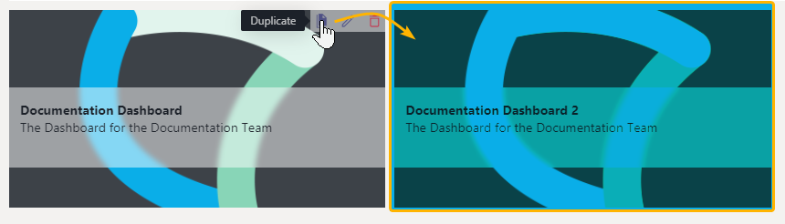
⮑The duplicated dashboard will be created same as "new" one, allowing you to adjust its properties and naming.
⮑Widgets and their Properties will be carried over to the duplicate
💡 After duplication a dashboard copy acts independently, meaning that you can fully configure all its properties and widgets without affecting the original. You remain owner of both the original and the copy.
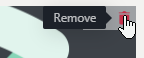
Removing a Dashboard
If you want to remove a Dashboard, simply click on "Remove" within the Dashboard overview.
☝NOTE: Dashboard Removal
- Removing Dashboards is irreversible. Any filter and widget settings will be lost.
- If a Nimbus User is removed, the associated Personal Dashboards are removed as well.
- Any Non-Personal Dashboards are made available (published) by Nimbus administrators. They cannot be removed via the Frontend UI. If the original creator of these boards is removed from Nimbus, a N/A placeholder is shown instead of the former owner, but the board still exists and can be managed by any administrator.